
March 21st, 2021 me and a group of students within my class participated in Visual Arts Competition as a team. I focused on the graphic design portion of the competition, and my long-term project was to represent ‘joy,’ through the art of paper quilling.
As I’ve never done paper quilling before, this was a challenge for me, but I am exceptionally proud of what I created! My artist statement goes as follows:
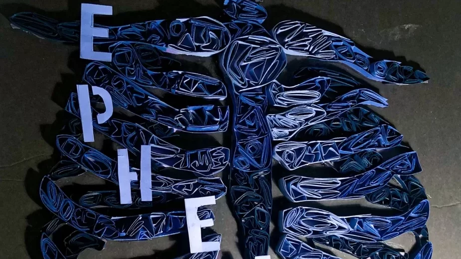
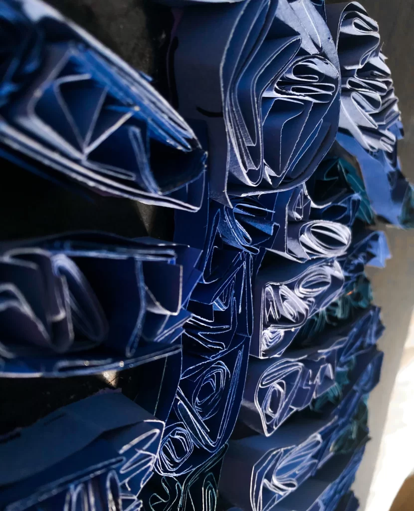
In my piece, Ephemerality, I created a piece to bring light to the joy of being released from the past. The title and word I accentuated, ephemerality, is the concept of everything being bound by time, existing for only a period. To represent this word, I started with a black base and used thin construction paper to create a solid base depicting human ribs. Afterward, I used Brodskaya’s technique to fold and create the quilting style we see in her pieces.
I stopped myself to ask what brought me the most joy, before beginning this project. Nothing could bring me more relief and delight than the idea that what I have endured is behind me. I remind myself that what I experience is transitory. Bad times pass no differently than a storm than the gradient of light itself. Using ribs to represent who I was, and the black, stark background to represent me stepping towards a period of growth, understanding, and recovery.
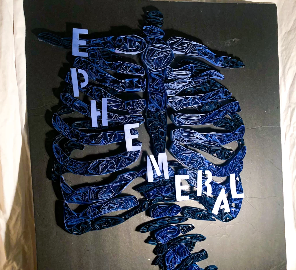
I had my family help me with the tedious part, putting paper into the spaces and filling everything up to be properly set. It took me very long, I’d guess around 36 hours total. I currently, even two months later, have no idea where to hang or put this project. If I want to sell it, I feel like I’d need to make it more ‘sturdy,’ so that pieces don’t fall off mid-transfer.
In this competition, we also completed a short-term, on-site project, where a prompt was given at a certain time, and we had two hours to create a piece. The prompt was again, to create a piece representing joy with paper cutouts (magazine, newspaper, construction paper, etc.)
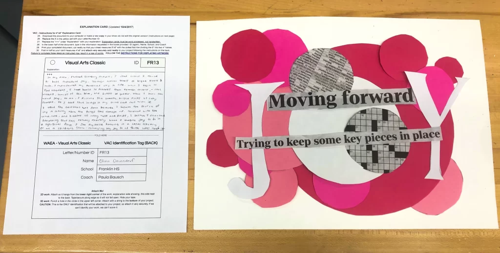
Here’s what I came up with.
In my piece, Flushed Sunday Papers, I used what I could best accentuate JOY. Through warm tones of bright pinks and reds, I represented my personal joy in life. When I begin to feel emotions, I have learnt to process them through colors – cool violets, waves of sea blues and bursts of yellow. When I hear the word joy, to me, I picture the warm, bright pinks of rosy cheeks. So I took that image in my mind, and all those colors, and I went with it.
I used the text ‘moving forward,’ and ‘trying to keep some piece in place,’ because I believe the source of joy is moving above the things that damage us. Combined with the word, text, and bubbles of rosy reds and pinks, I believe I created something that can convey exactly what I imagine joy to be in a physical form. I see my piece hanging in a local library, or at a children’s store – conveying my joy to those who need it most.
I earned a 16/20 overall on my first piece, and a perfect score, 20/20, on my on-site.
I hope to participate next year as a senior! I want to thank my art teachers, and best friend, Nate, for helping me be successful.
– Vee Devendorf